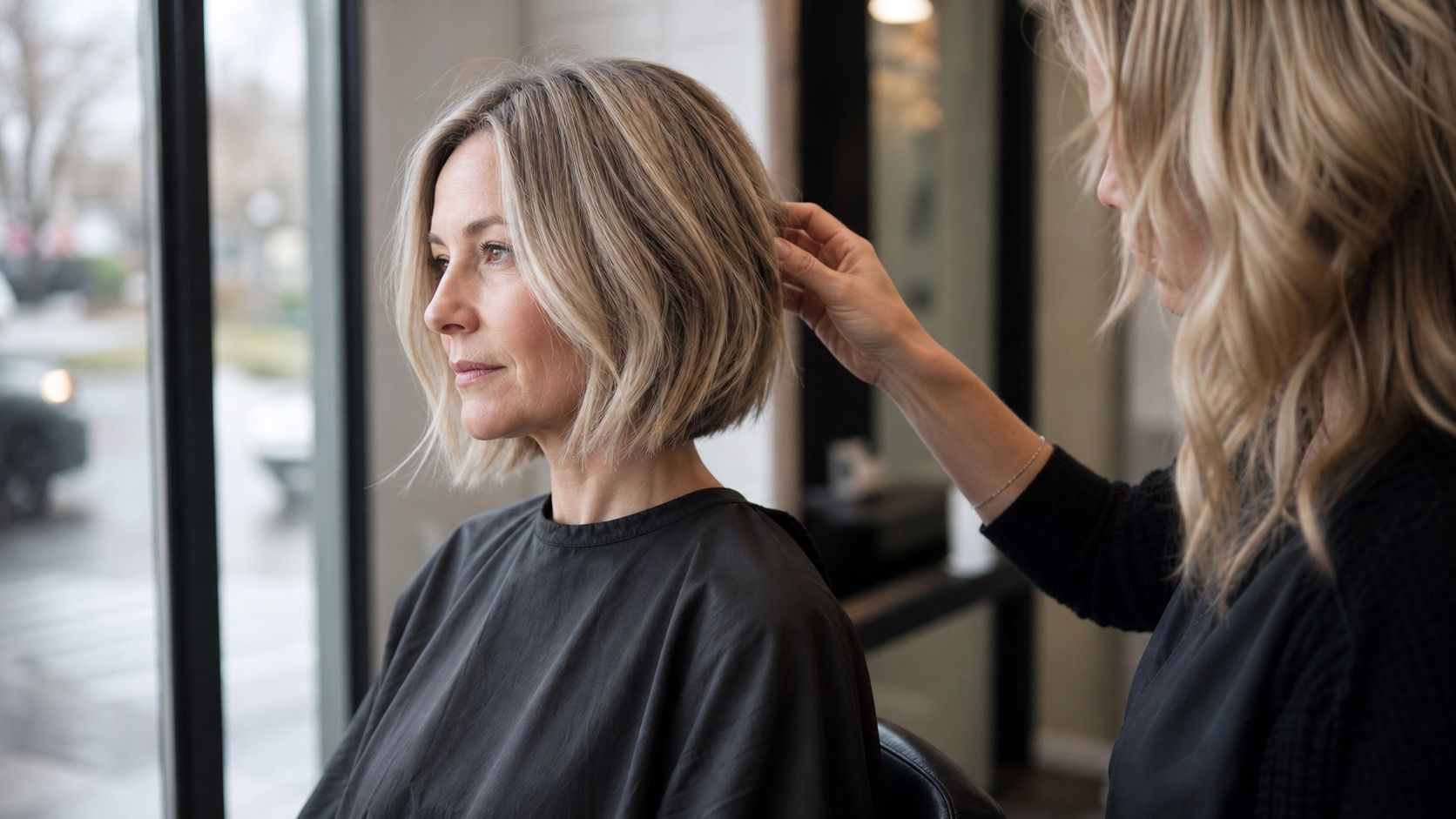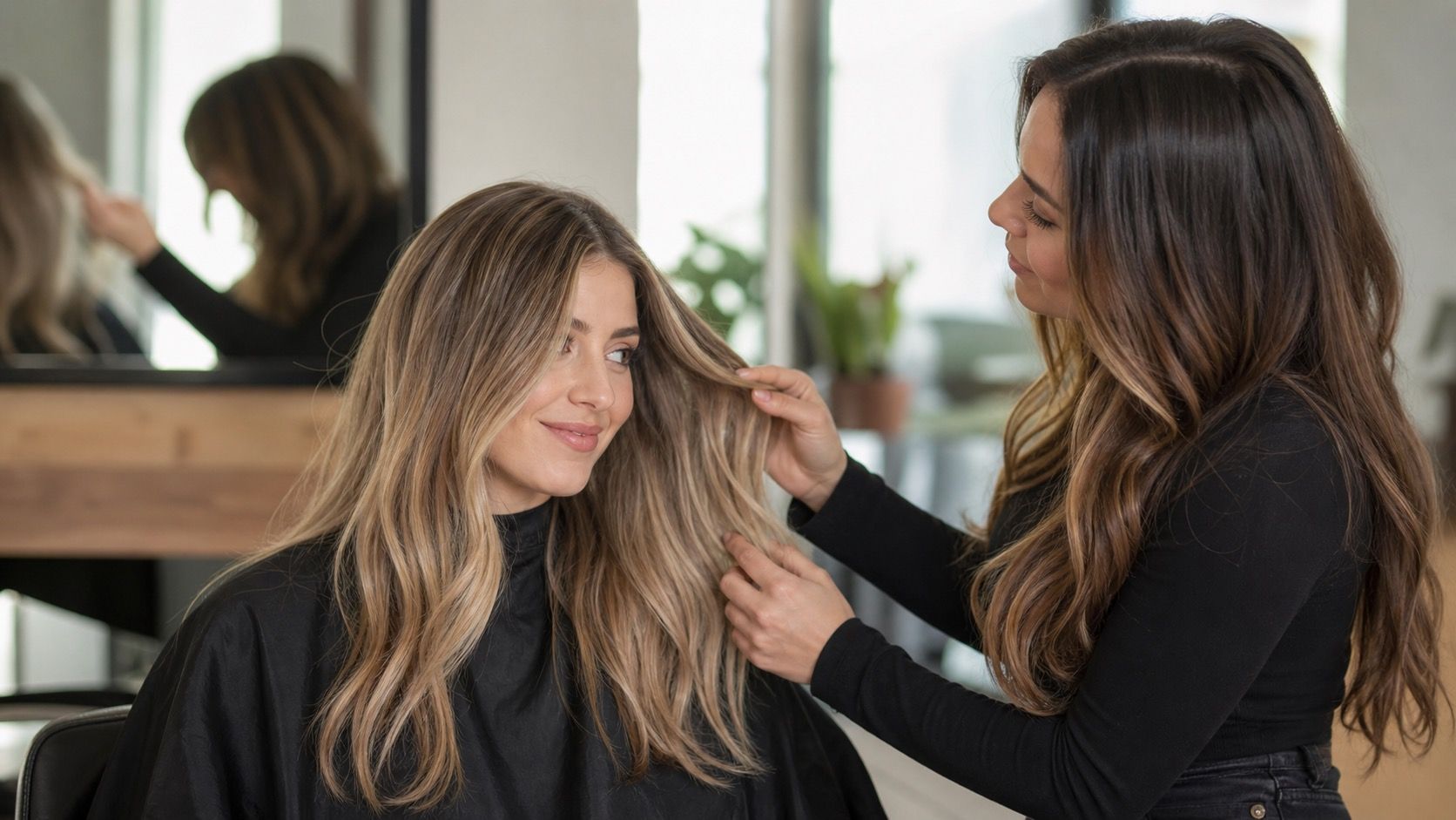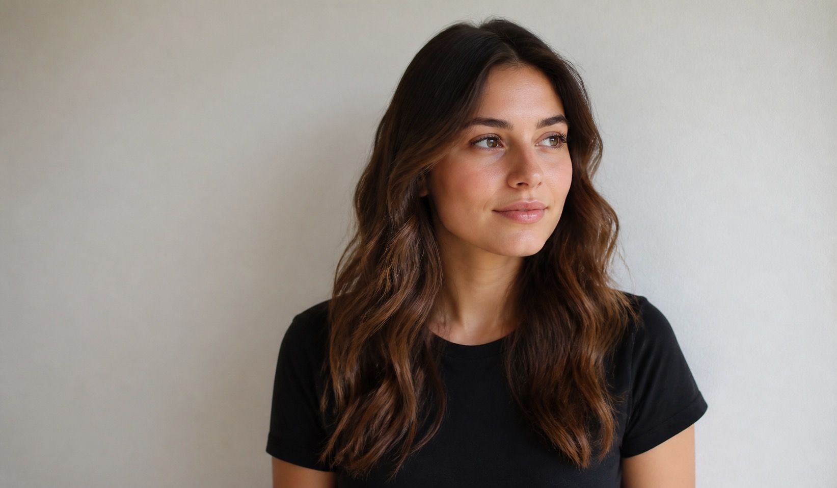
A virtual hair color try on is most helpful when it answers a narrow question: could this shade family suit my face better than the one I have now? It cannot predict bleach lift, a toner’s fade pattern or the effect of a salon’s lighting, but a careful photo can make the preview far more useful than a random filtered selfie taken in a dark room.
Why a preview can look wrong before the shade is even added
Most strange-looking results begin with the original photograph. A phone camera may make indoor bulbs look neutral, even when they are pushing the skin yellow. A beauty filter can smooth the hairline, lighten the eyes and erase the shadows that normally give a face its shape. Then the virtual hair colour try-on is placed on top of an already altered image, and the final blonde or brunette is judged as though it were a real mirror reflection.
Set up one clean reference photo
Face a window on a bright but overcast day, or stand a step back from it so the light reaches both sides of the face. Direct sun creates hard highlights that a preview may mistake for blonde pieces; a dim room makes the same tool fill the hair with a flat, inky block. Turn off coloured lamps, step away from a vivid wall and use a neutral background if you can. A pale grey wall, plain door or uncluttered corner is enough.
Wear little or no complexion-changing makeup for the reference image. Heavy contour, self-tanner and a bright lip are not forbidden, but they should not be the only version you use when deciding between a cool brown and a warm caramel. Take a second photo in your normal daytime makeup if that is how you will wear the colour. Comparing both images shows whether the proposed shade works with your actual routine rather than only with a stripped-back test face.
Fix lighting and white-balance mistakes before comparing shades
White balance is the quiet culprit in many hair color try on results. In a warm kitchen, ash brown can appear greenish or grey. Near a cool window at dusk, a beige blonde can look almost lavender. Before trying different shades, compare the photo to a white sheet of paper held near your face. If the paper looks orange, blue or pink on screen, the whole preview is being judged through a colour cast.
Do not correct the image so heavily that it becomes a new filter. A small exposure adjustment is reasonable if your face is in shadow; aggressive editing is not. Keep the background and skin believable, then try a cool, neutral and warm version of the same depth. This makes the difference easier to see. If every option looks surprisingly good, the lighting is probably flattering the image more than it is revealing a useful hair decision.
| Photo issue | What the preview may falsely suggest | Simple correction |
|---|---|---|
| Warm overhead bulbs | Cool shades look muddy or green | Retake facing a window with lamps off |
| Strong direct sun | Blonde placement looks brighter than it will indoors | Move into open shade or indirect light |
| Beauty filter | Any shade appears smoother and more even | Use the unfiltered camera image |
| Dark background | Light hair seems more dramatic than it is | Choose a plain mid-tone background |
Keep the real hairline and texture visible
A convincing preview should show the places where colour has to live in real life: the hairline, part, temple area and ends. Pulling all hair behind the ears may help facial recognition, but it gives the tool little information about density and leaves you with a pasted-on result. Wear your normal part and let enough of the front lengths fall forward. If you usually have a fringe, include it; fringe colour changes the amount of contrast around the eyes more than many people expect.
Texture matters too. Curly and coily hair reflects light in small, uneven points, while sleek straight hair displays every tonal transition. A filter that paints one uniform blonde sheet over loose curls is not a reason to abandon blonde; it means the preview is not modelling the way highlighted texture behaves. Take one image with your usual curl pattern and, if you occasionally heat-style, another with smoother hair. The useful range is the one that still looks plausible in both versions.
Test depth before chasing a specific named shade
Begin with three broad depth options: close to your present colour, two levels lighter and two levels darker. A virtual hair color try on free tool is often better at showing this big contrast change than at distinguishing mushroom brown from ash mocha. Once you know whether lighter or deeper hair brings your features forward, compare two or three tones inside that depth. Trying twenty named colours in a row tends to make every image feel unfamiliar and makes small differences impossible to remember.
Save only a few screenshots, labelled privately by depth and tone rather than by a brand name. Look at them the next morning on a different screen. The shade that still feels balanced after the first novelty has worn off is usually more informative than the one that looked most dramatic at midnight. A preview can also reveal a useful negative: if very dark hair makes your brows and under-eye shadows look stronger in every neutral photo, that is worth knowing before a permanent colour appointment.
Read the result as a range, not a salon promise
A try-on does not know your previous colour, porosity, grey coverage needs or how quickly warm pigment will show through lightened hair. Treat the image as a conversation starter. A screenshot can tell a colourist that you prefer a soft medium brunette over a high-contrast black, or a beige blonde over bright gold. It cannot tell them that the exact virtual shade will be reachable in one appointment without compromising the hair.
Bring the original photo as well as the saved preview, and say what you liked about it: the depth near the face, the softness of the root, the amount of brightness at the ends. That gives room for professional judgment about lift, toner and maintenance. The best preview is not the one that looks perfectly edited. It is the one that helps you name the direction you want while leaving enough space for your actual hair to set the limits.